Data management is the bottleneck for product introduction in the market. Measurement data can be displayed in different formats and styles depending on the characteristics that need to be highlighted. Moreover, end-users always ask for additional data to be disclosed and different graphs to be added to the datasheets and reports, requiring consequent engineering time that is not used in added-value engineering tasks.
How does the Whiteboard Visualization tool solve well-known problems?
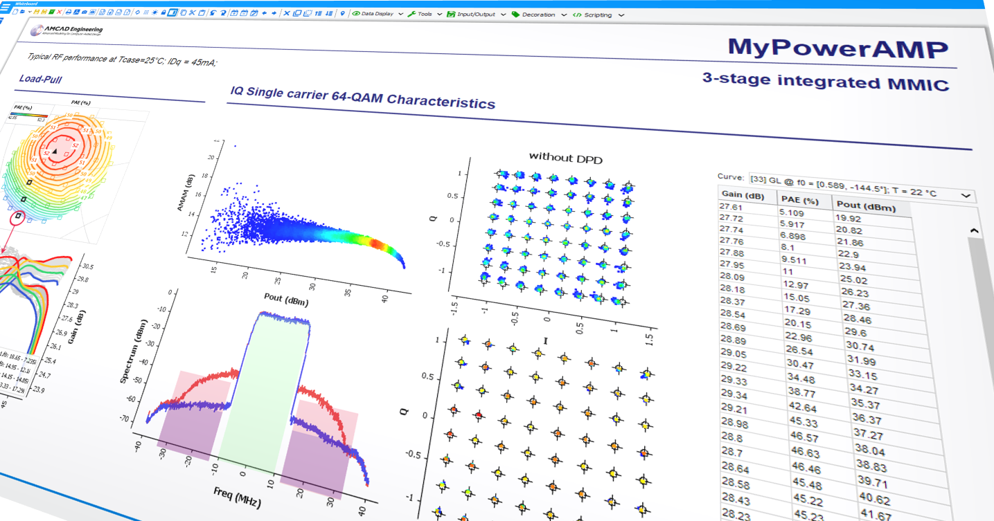
- The visualization tool eases FOM extraction (Figure of Merite) applied to data even for big files (several hundreds of MB), which can be easily generated when the signal is a wide digital bandwidth modulation, as for 5G signals.
- Time-saving: Everything is under the same platform. It saves precious time for reports and presentations. Select the interest results and reuse a visualization template with interactive sliders to update the FOM in real-time. There is no need to relaunch a new set of measurements if your customer wants an update with a new setting.
- Manual reporting, which costs much time, can give way to automatic reporting with the Whiteboard tool. This functionality allows the creation of templates that apply directly to the different measurement results. A datasheet template can be created, and the different results can be applied to it. The whiteboard extracts useful and relevant information in a snap. It also makes it easy to compare how the results have changed from one test to another if adjustments are made on the circuit.
- Define custom equations: The reporting tool includes a “script editor” mode where all the Whiteboard’s ready-to-use functions can be customized. This mode contains features and libraries specifically developed for RF signal post-processing to facilitate the job.
The little extras you’ve been waiting for :
- Make attractive presentation: In addition to the content, the container can have a decisive impact on the perception of the quality of the work done for clients or colleagues. Consolidate best practices within your group. Your personalized models can be shared to standardize data analysis, share your models with your customers in the form of an interactive and engaging report.
- The visualization tool uses an interactive and dynamic graphical interface in real-time for data reporting. Thanks to different filters, sliders, and tables linked to relevant parameters, endless possibilities are available. This feature allows exploring in more depth the results obtained
- Multiple file types are supported by visualization tools : There is no need to switch between different software interfaces with different tools to use the different file formats, depending on whether they come from a test bench or a simulation.