
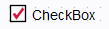
CheckBox
Overview
This control reacts to clicking events, but it has different operating modes and is aesthetically parametrizable. It behaves exactly as Button except it is togglable by nature as Radio Button.
Configuration
Three menus are available :
- Display:
- Text : Text content of the checkbox
- Tooltip : Text to display when the user is hovering his mouse over the control
- Image (selected) : image to display when checked
- Image (deselected) : image to display when unchecked
- Font
- Text Color
- Background Color
- Selection Color : color of the tick inside the box when checked. If
red for example :
- Border Color
- Border Type
- Behavior:
- Selected : Is checked if the button is selected while using the togglable property
- Group : defines a group where the control belongs, only one control can be selected at a time as with Radio Button. If a button belong in a group, it is no more togglable by himself, only others checkbox in the group can reset the other ones. It can be attached to the same group as a Button or a Radio Button.
- Events: Script to execute when cliking the control, if the checkbox is toglable but not in a group, executes the code on activation and on desactivation.
Example
See Button for more information.