Button
Overview
This control reacts to clicking events, but it has different operating modes and is aesthetically parametrizable.
Configuration
Three menus are available :
- Display:
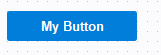
- Text : Text content of the button :
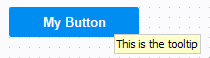
- Tooltip : Text to display when the user is hovering his mouse over
the control :
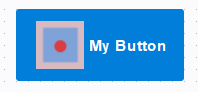
- Image : Image to display left to the text, inside the button :
- Font
- Text Color
- Background Color
- Border Color : available if Highlighted is unchecked
- Border Type : available if Highlighted is unchecked
- Corner Radius
- Button Type : Multiple preset are specified here, if one is choosen, it will overwrite the background properties, but not clear the settings so that if 'none' is reselected, the last settings are used.
- Highlighted : Highlights the control if mouse hovers it
- Text : Text content of the button :
- Behavior:
- Togglable : Maintains the state of the button until another click : the button remains selected or unselected.
- Selected : Is checked if the button is selected while using the togglable property
- Group : defines a group where the control belongs, only one control can be selected at a time as with Radio Button. If a button belong in a group, it is no more togglable by himself, only others button in the group can reset the other ones. It can be attached to the same group as a CheckBox or Radio Button.
- Events: Script to execute when cliking the control, if the button is toglable but not in a group, executes the code on activation and on desactivation.
Example
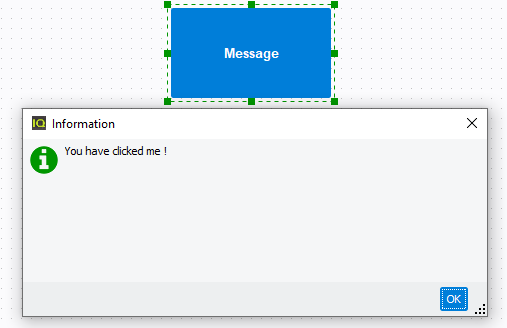
- A simple button :In this example, we will want to execute a script each time the button is clicked. In our case, it will show a message with the following script :

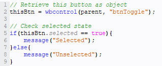
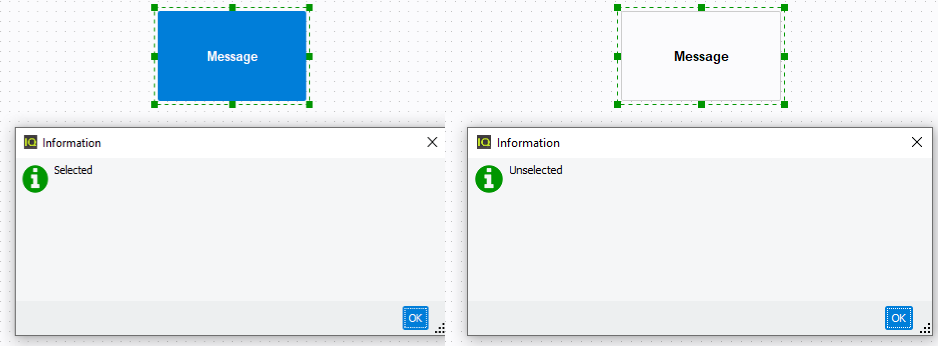
- A togglable button :In this example, we will want to execute a script to detect each states of a togglable button. It will be similar to the previous example :
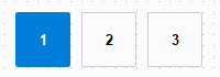
- Togglable buttons :In this example will be shown how behaves a set of buttons that belongs to the same group :