Graph
Overview
In ![]() drop down menu, the (
drop down menu, the (![]() ) icon allows to insert a graph in the
workspace. Click on (
) icon allows to insert a graph in the
workspace. Click on (![]() )
then, anywhere in the workspace, drag the mouse to delimit the graph dimensions.
)
then, anywhere in the workspace, drag the mouse to delimit the graph dimensions.
Select the graph and the configuration tab in the 'Whiteboard Tools' panel to access
the control options. Click on  in the bottom right of the panel in order to update
the graph settings.
in the bottom right of the panel in order to update
the graph settings.
Using  button (left-bottom of the panel), it's possible to
save the current graph settings (markers, legends, colors, ...) as default settings.
Once saved, the configuration of a new graph will be automatically done using saved
settings.
button (left-bottom of the panel), it's possible to
save the current graph settings (markers, legends, colors, ...) as default settings.
Once saved, the configuration of a new graph will be automatically done using saved
settings.

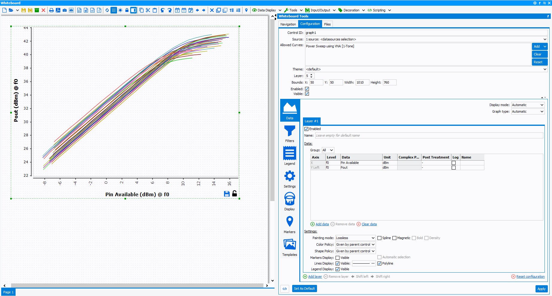
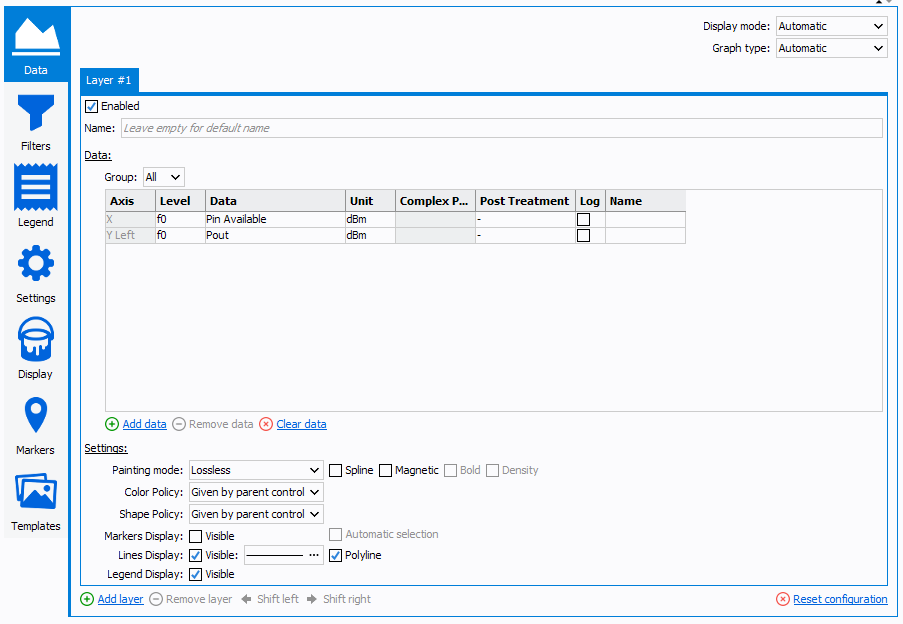
 Data
Data
Click
 to add data and
 to delete it.
- Axis: select the axes (X, Y Left, Y Right, Z) corresponding to the data to display
- Level:select the level corresponding to the data to display.
Note: The level can be an harmonic level (f0, 2f0, 3f0 …) or subtraces (Sprectrum, IQ, EVM …). The level setting helps sort the data when harmonics (Level : f0, 2.f0, 3.f0 ...) or 2-tones (Level : 2.f2-f1, f1, f2, 2.f1-f2 ...) measurements analysis are required.
- Data: select the data to display Note: The data list depends on the *.imx file loaded in the 'Datasource', and/or on the 'Allowed curves' defined and on the 'Level' selected. The data list is sorted in alphabetical order.
- Unit: select the units corresponding to the displayed data
Note: The unit list depends on the selected data.
- Complex Part: select the complex part corresponding to the displayed data when this one is a complex number (A1,B1,A2,B2, Zin, Zload ...)
- Post-treatment: invert the sign of the displayed data
- Log: plot the data in logarithmic scale
- Custom name: custom name for the displayed data
- Graph type: select the graph type (X/Y, Locked X/Y, Polar,
Y Smith Chart, Z Smith Chart)
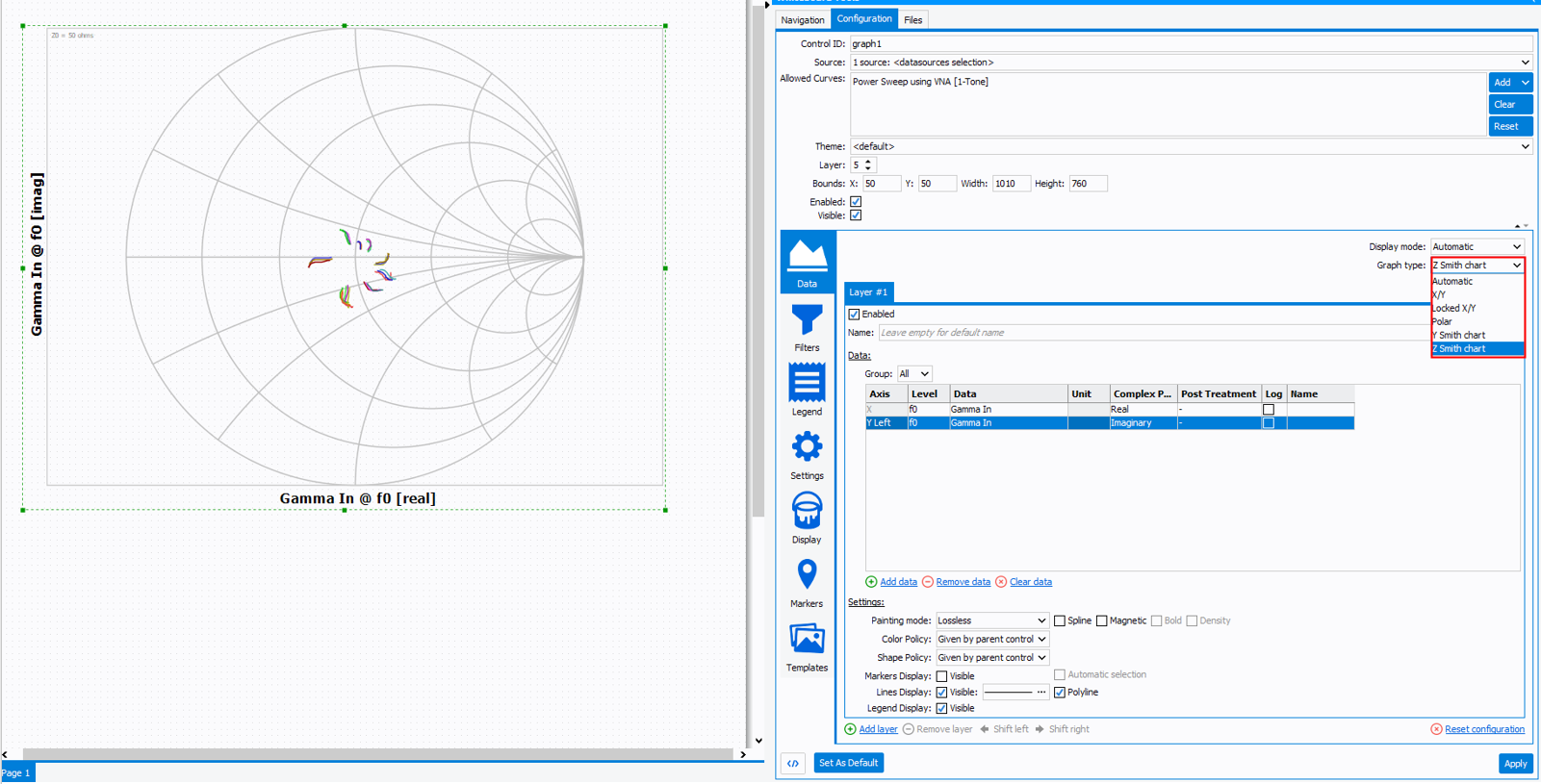
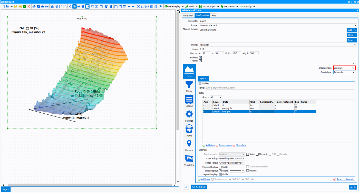
- Display mode: select the graph mode ('Automatic' depends on
the datasource *.imx file, 'Plot' to forcce a 3D graph or to force a 3D
graph in 2D or 'Contours' to force a 2D graph in 3D )
- Settings: define the main diplay options.
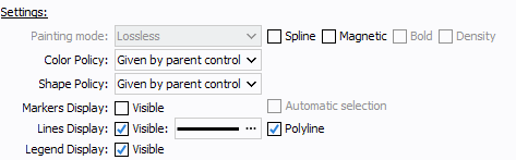
- Painting mode: choose three predefined display
settings :
- LossLess: This predefined display allows
the full graph display capabilities. (Not recommended,
in term of performances, for large data display as
spectrum or IQ traces.)

- Optimized:This predefined display is
suitable for large data as spectrum or IQ traces. It
automatically disables "Spline", "Magnetic", "Bold",
"Density" and "Marker Display" options to improve
display performances.

- Dots:This predefined display is suitable
for large data as dynamic AMAM & AMPM. It forces
"Markers Display" in "Dots" mode and automatically
disables "Spline", "Magnetic" and "Lines Display"
options to improve display performances.

Note: Painting Mode is disabled for 3D plots.- Spline: Apply a spline on the displayed
curve .

Note: Spline interpolation method can be defined in Settings/Advanced. - Magnetic:This option allows to make the
marker plot magnetic, which is useful to link a marker
data on the specific plot.

- Bold: In "Dots" mode, this option forces
the marker display in bold.

- Density: In "Dots" mode, this option
highlights the marker density using color gradient
rules. Red color describes the area where the density of
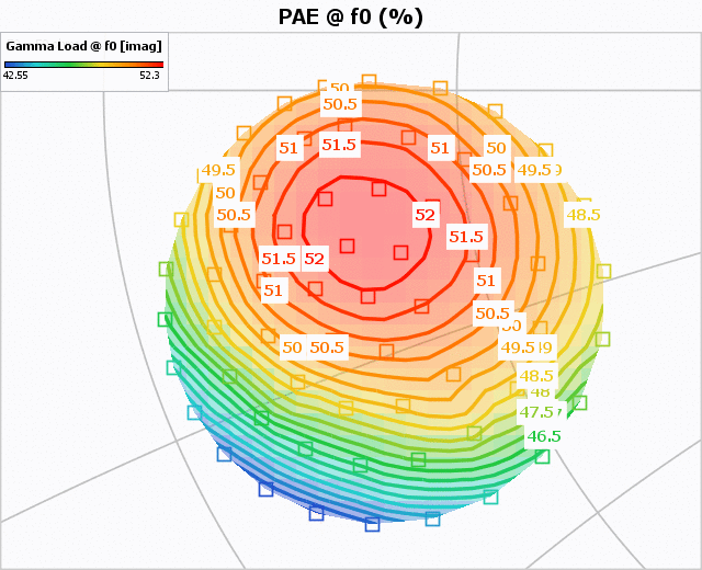
point is the highest, and blue color the lowest. In this
example below (dynamic AMPM), the red area highligth the
average AMPM and Output power of the signal.

- LossLess: This predefined display allows
the full graph display capabilities. (Not recommended,
in term of performances, for large data display as
spectrum or IQ traces.)
- Color policy: select the color rules to apply on
the displayed curves.

Color policy list : Given by parent control, Unique, One by variable, One by layer, One by layer name, One by data, One by data name, One by axis, One by curve, One by parent curve, One by dataset, One by datasource. - Shape policy: Allows to select the marker shape on the displayed curves. The list of choices is equivalent to the color policy list.
- Marker Display: enable/disable the marker
display.
- Automatic selection: This options will automatically select all the markers of the displayed curves. This selection can be used to forward subcurves or traces to another graph.
- Lines Display: enable/disable the lines
display.
- Polyline: apply Polyline on the displayed curves.
- Stroke Editor: Selecting the
 icon, a stroke editor menu
is openned. This menu allows to set the lines
display.
icon, a stroke editor menu
is openned. This menu allows to set the lines
display.- Thickness: This parameter is used to set
the line thickness.

- Dash Patern: This parameter is used to
set a dash pattern.

- Dash Phase: This parameter is used to set a dash phase.
- End Cap: This parameter defines the bond between two points.
- Line Join: This parameter defines the angle display of the line.
Note: The preview allows to appreciate the line display settings. - Thickness: This parameter is used to set
the line thickness.
- Legend Display: enable/disable the legend
display.Tip: Shortcut: "L" on the keyboard.
- Painting mode: choose three predefined display
settings :
Layers are usefull to display on the same graph
data with different size, data with different display settings and data with
different parent sources. Click  to add new layer and
  to delete one
of them
to delete one
of them
- The datasource (All curves: multi-frequencies and multi-biasing)
- The Filter (filtered curves: one frequency defineed in the filter and multi-biasing)
The first layer is used to display all curves (datasource) in color policy unique gray, and the second layer is used to display the filtered curves (filter) in color policy one by variable.

 to move layer
position therefore send backward or bring forward each layer.
to move layer
position therefore send backward or bring forward each layer. .
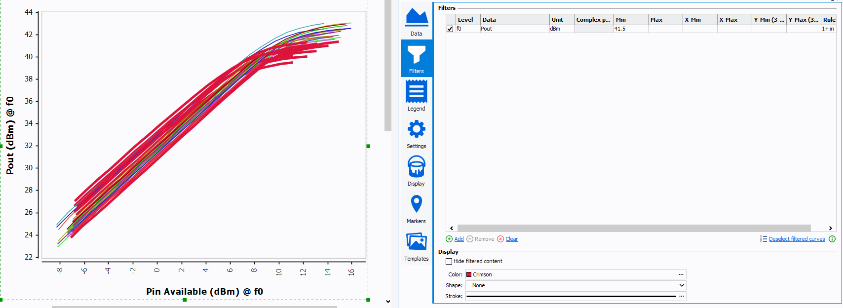
. Filter
icon will add a filter,
clicking on the icon
will remove a filter. 
- In 2-D, filters do not remove points; to pass, each curve must validate enabled filters in given order. If a curve validates all filters, it will be displayed
- In 3-D, each point is filtered, so they are removed from final contour if they don't validate all filters
- Regarding deselection of filtered curves, this action also apply to curves that contain errors
 Legend
“Legend” menu allows to manage the legend title and legend description of the selected plot.
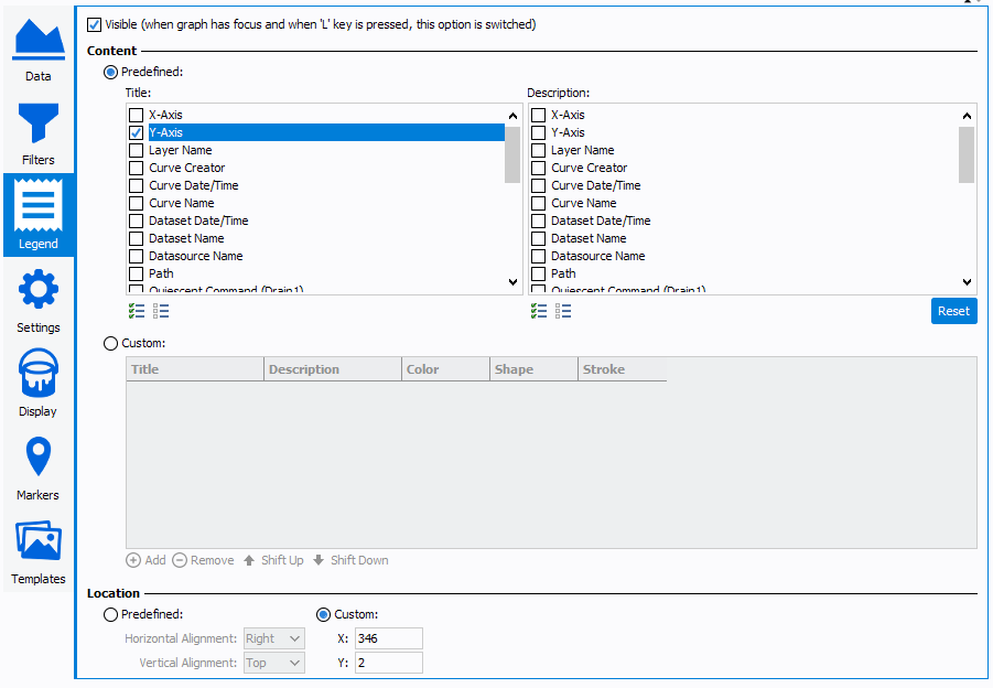
- Visible: enable or disable the legend display Tip: Shortcut: "L" on the keyboard.
- Custom Title & Description: select the information to display in the legend
-
Location: set X and Y coordinate for legend location on the graph.Note: Shortcut: keep pressed the mouse wheel on the legend to move it.
 Settings
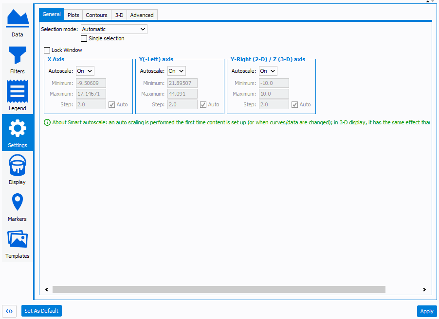
- General:
- Lock Windows: allows to lock the graph scale. When 'lock
windows' option is enabled, the X and Y scale cannot be changed using
the mouse wheel zoom feature Tip: Shortcut:
 icon on the
bottom right of the graph.
icon on the
bottom right of the graph. -
Axis:
- Autoscale: set the autoscale option ('Smart', 'Off', 'On') of the selected axis
- Minimum: set the minimum value of the selected axis
- Maximum: set the maximum value of the selected axis
- Step: set the step value of the selected axis
- Lock Windows: allows to lock the graph scale. When 'lock
windows' option is enabled, the X and Y scale cannot be changed using
the mouse wheel zoom feature
- Plots:
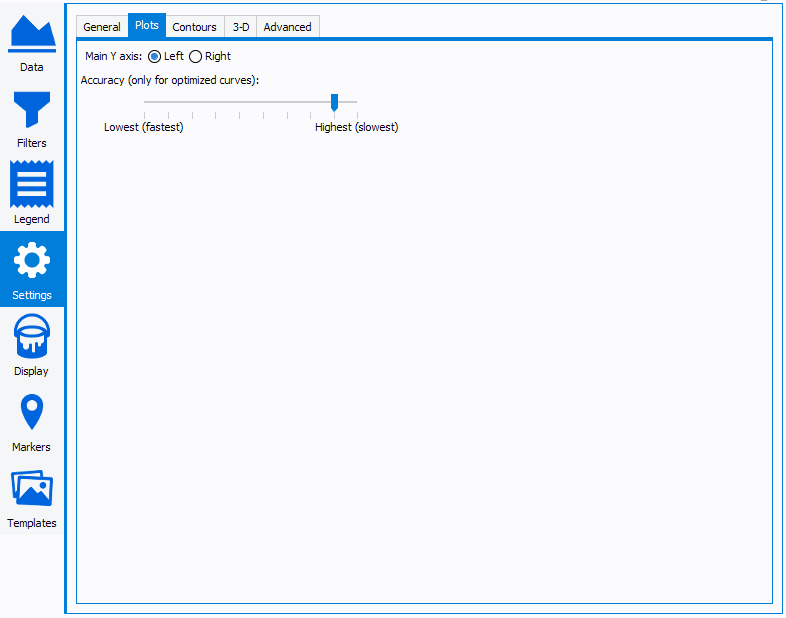
- Main Y axis: select the main axis (Left or Right)
- Accuracy: select level to optimize graph latency. Useful when the number of point to display are important (AM/AM dynamic, AM/PM dynamic, Spectrum …)
- Contours:
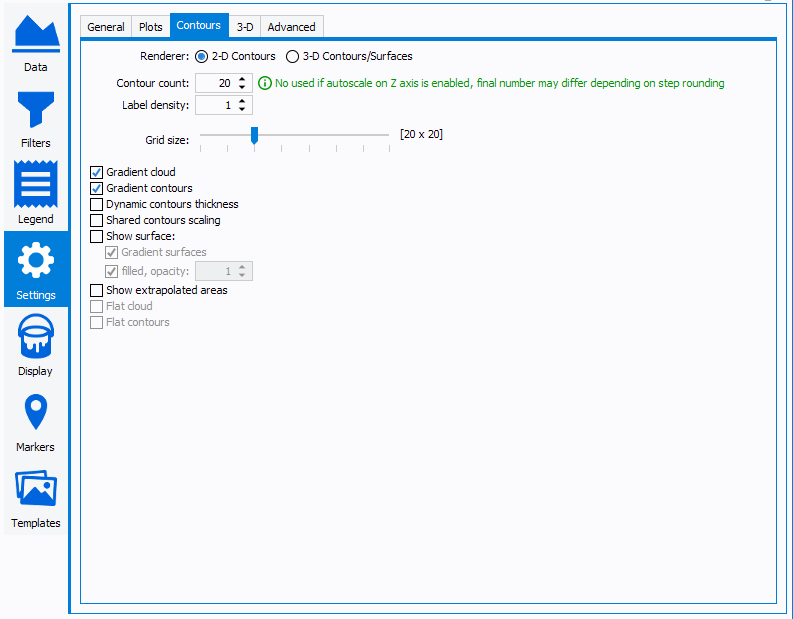
- Renderer: use 2-D Contours to plot iso-contours or 3-D to
plot 3-D surfaces.

- Contour count: set the number of iso-contours to
display

- Label density: set the number of label as function of the
contours numbers (e.g : if set to 1, one label per contours will be
dsiplayed)
- Gradient Cloud: used to apply gradient color on markers cloud.
- Gradient Contours: used to apply gradient color on contours line.
- Dynamic contours thickness: used to apply a variable contour line thickness as function of the contour value.
- Share contours scaling: used to share the same Z scale for all Z-data displayed.
- Show surface: used to display contour surface with
gradient and opacity options.

- Show extrapolated areas: allows to display extrapolated
area

- Renderer: use 2-D Contours to plot iso-contours or 3-D to
plot 3-D surfaces.
- 3-D:This tab allows to set the advanced 3-D graph parameters.
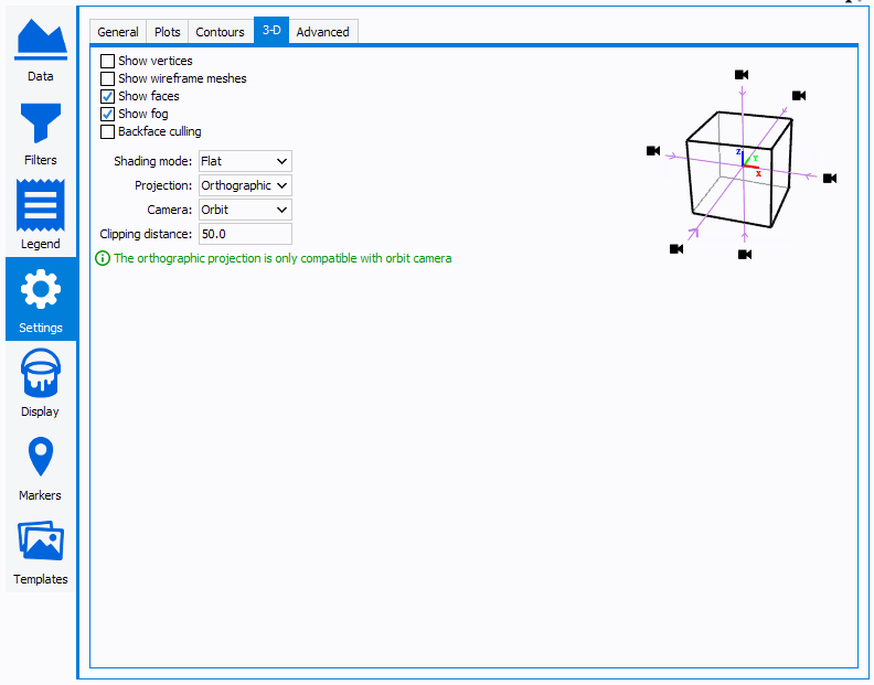
- Advanced:
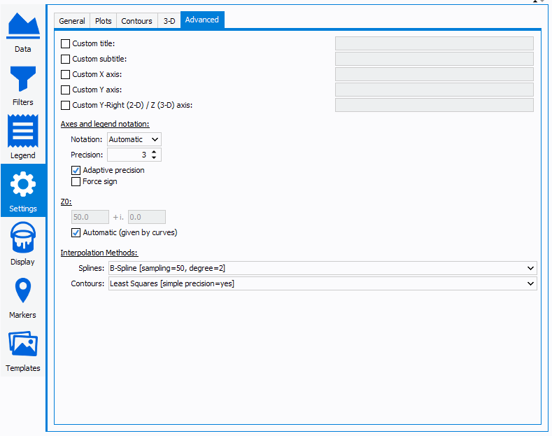
- Custom Title: customize graph title
- Custom X-axis: customize X-axis name
- Custom Y-axis: customize Y-axis name
- Custom Y-Right axis: customize Y-Right axis name
- Values notation: select the type of axis notation (Engineering, Scientific...)
- Values precision: select the precision of the values
- Z0: set the characteristic impedance value for the smith chart plot
- Interpolation Methods : set the Spline method used for
and Contours interpolation.
- Available Spline methods:
- linear: Linear interpolation.
- bspline: B-Spline interpolation.
- cspline: C-Spline interpolation.
Available properties:
- sampling: Sampling (all except Linear), default: 50.
- polydeg: Polynomial degree (B-Spline only), default: 2.
- Available Spline methods:
 Theme
& Display
Theme
& Display
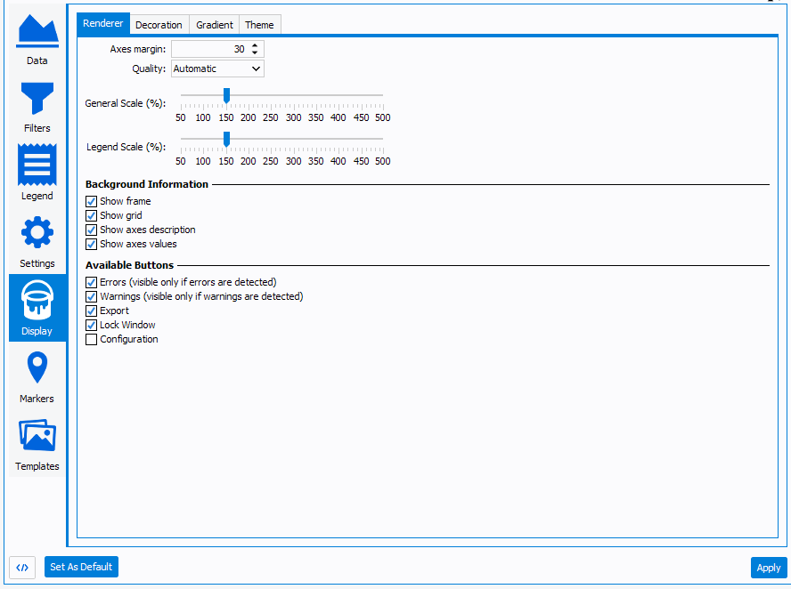
- Renderer:
- Axes margin: modify the margin between the edge of the graph component and the axis
- General Scale (%): select the general scale of the
graph. It includes the border thickness, grid thickness, value and
axis title scale
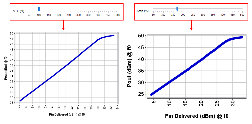
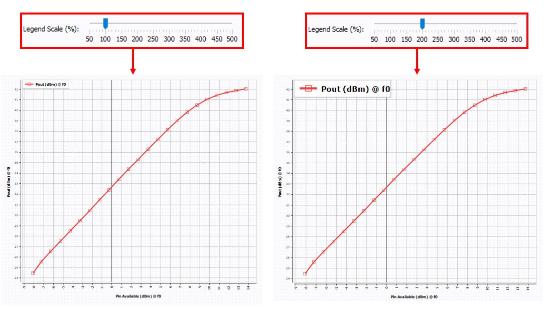
- Legend Scale (%): select the graph legend scale
.
- Background information:
- Show frame: enable or disable frame display
- Show grid: enable or disable grid display
- Show axis description: enable or disable axis description display
- Show axis values: enable or disable axis value display
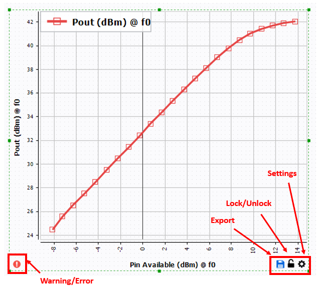
- Avaliable Buttons: enables or disables the buttons
options on the graph
- Show error: enable or disable error shorcut.
- Warning: enable or disable warning shorcut.
- Export: enable or disable export shorcut.
- Lock windows buttons: enable or disable lock windows shorcut. When 'lock windows' option is enabled, the X and Y scale cannot be changed using the mouse wheel zoom feature
- Configuration:enable or disable configuration shorcut.
-
- Decoration:

- Curve color and shape:
The curve color and curve shape table is used to define the sequence. Click on
 or
or
 to manage the color sequence.
In the example below, only two colors and two shapes leading
to only two color combinations.
to manage the color sequence.
In the example below, only two colors and two shapes leading
to only two color combinations.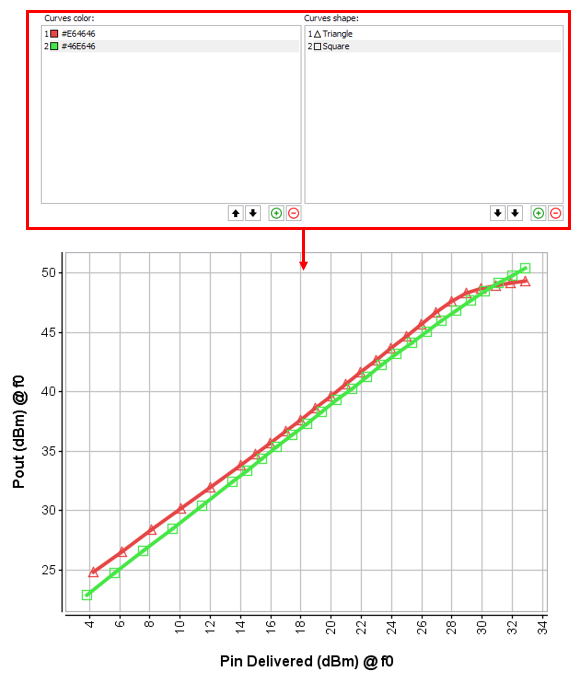
- Curve color and shape:
- Gradient: used to define a custom gradient color rule for 3-D graph
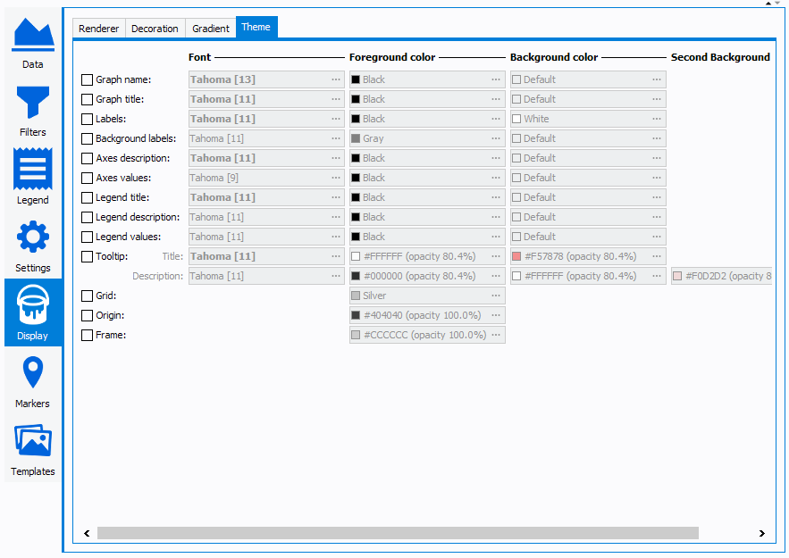
- Theme: used to define a custom graph theme. Set the
Font and color of the graph name, axis, legend, …
 Markers

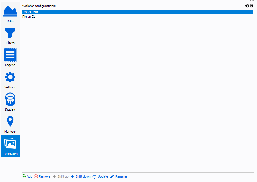
 Templates
Templates allows to save "predifined" graph settings and made available in a drop down menu located on the top of the graph. This feature allows to switch easily from a view to another.