Slider
Overview
This control is used to generate a number regarding its position, that can be used in
several ways. It is meant to be used as an easy input, for the user to choose a
numerical value, that is however bounded.
Configuration
Three menus are available :
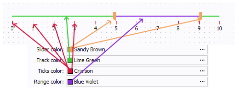
- Display:
- Font
- Text Color
- Background Color
- Border Color
- Border Type
- Slider Color
- Track Color
- Ticks Color
- Range Color
- Checkable parameters:
- Show track
- Show ticks
- Show labels
- Vertical : sets the orientation of the slider, if checked, slider will be vertical.
- Inverted : sets the slider values order, if checked, order is set to descending order.
- Behavior:
- Minimum: sets the minimum slider value
- Maximum: sets the maximum slider value
- Value: sets the slider value (updated with user interaction)
- Extent: sets the slider selection width (only in range mode otherwise set to 0)
- Range: If checked, sets a range with to curors instead of one value with one cursor
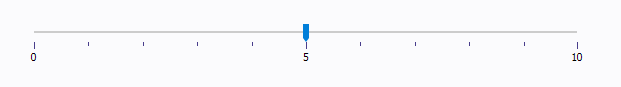
- Major spacing: Sets the spacing between major ticks (labelled ones)
- Minor spacing: Sets the spacing between minor ticks (ticks
between the major ticks). For example, with a major spacing set to 5
and a minor spacing set to 1:
- Labels: Used to define custom labels at the ticks, overwritting the default numbers.
- Events: Script to execute when the cursor position has changed.
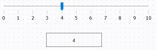
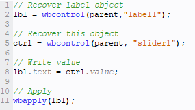
Example
In this example, we want to display in a label the value set on the slider by the
user.